Print Quality Analysis—User Elements
Print Quality Analysis includes the user elements of Text, Lines, Tints & Blends, Computer Graphics, and Photographic Images—as well as process characteristics of the RIP/controller, print marking engine and media.
Tints & Blends
-
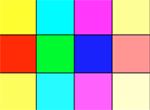
Tints
Unlike solid printing, tints introduce an increased sensitivity to resolution and mechanical issues. A tint is a large area of a single unsaturated color, such as pink, sky-blue, or brown. Therefore, it is also sensitive to hue color errors.
Traditional screening creates a tradeoff between resolution and the number of available intermediate colors that may be unfavorable. To enhance the number of colors a printer can produce, vendors have often introduced super-pixel dithering over traditional screening—even though this runs some risk of introducing pattern artifacts and moiré effects that can be annoyingly visible. Stochastic screening modulates the placement between high-resolution dots (spatial frequency modulation), minimizing most artifacts; however, this technique requires good color registration and may yield grainy pastels.
Blends

Blends are smooth transitions between two or more colors. While incorporating all the issues of tint generation, Blends additionally require an abundance of color levels, smooth transitions between these colors, and perceptual linearity of hue, saturation, and lightness ramps.
Highlights and shadows often deteriorate blend quality. This is due to the difficulties involved in providing accurate differentiation of shades in heavily toned regions, and in providing a sufficient number of pastel shades to smooth the transition to paper white.
Since a majority of print jobs will require a conversion from RGB to CMY, and since user documents in this market segment are increasingly created in RGB, the ability to produce high-quality RGB blends is more important than CMY blends.